Wednesday 23 March 2011

Evaluation Question 4 - How did you use media technologies in the construction and research, planning and evaluation stages?

Different media technologies were used throughout all stages of the coursework unit. The research and planning stages involved technologies such as google search engine, google images, youtube, dafont and blogger. The search engine we used in the planning to research the genre of supernatural thriller we had chosen to base our productions around.


The Images branch of the website search engine google we used frequently to collect example images of posters and magazines front covers to analyse in our planning.

The well known world wide media site google we used alot to help with our planning and research stages to find example trialers to analyse an gain inspiration for our own productions.

We made use of the site dafont.com alot in the planning stages of our production in order to choose a genre related font that would create the right atmosphere for our trialer, poster and cover. Dafont had a wide variety of fonts what you are able to choose from and download for free.


Blogger obviously was used frequently throughout the production to post our planning and analysis keeping track of our progress throughout the production of the entire project.


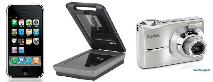
Our planning process also made use of technologies such as digital cameras and camera phones to take our own images to compare settings etc..
Another technology we used was the scanner we used this to scan in our hand drawn plans for covers and posters.

In the production process more media technologies were used throughout. These were softwares such as Indesign, photoshop, serif movie plus 5, fireworks and paint. Indesign is a print editing programme that allows you to use different layers to create a product with a very proffessional finish, this is the same as the progremme fire works on a slightly different variaiton of the software, Indesign was used to create the magazine front cover and fireworks for the poster. Photoshop is a photo editing software that allowed us to change colours, contrast and backgrounds of the images we intended to use in our productions, this was used for both the print productions. Paint and Mircrosoft word were used for the more basic parts of the production e.g. we created the production logo in word and print screened it into paint to make it an image rather than a document. The software Serif Movie Plus 5 was our film editing software where we were able to add in transitions text and other editing techniques to produce a professinal production.


Hardware was also used in the production of our tasks this included the video camera we used to film our trailer and the digital camera we used to take the images for our poster and cover.


Finally our evaluation used tenchnologies such as blogger which was mentioned above which is the webpage I am using now to currently write my evaluation. Other methods have also been used, I have created image through print screening into paint to show examples in my evaluation, I have made spider diagrams created in word to help evaluate conventions in my poster and cover.


I aslo need to collect audience feedback we did this through the use of facebook, we used this to post our productions on and got people to comment, we did the same using youtube.

Evaluation Question 3 - What have you learned from your audience feedback?

Audience feedback is an important part in the development of media products, finding out what your target audience likes and dislikes about your products is essential to improve it. We used a variety of methods to gain our audience feedback on all of our tasks. One of these methods was posting our tasks on facebook, this then allowed people to comment underneath what they thought of our productions. This was also a good site to post on becasue our target market very much revolves around the social networking site facebook. Another method we used was a feedback session in our media class this was very helpful as this was a group of people of the right age for our target audience and these are all media students so have a better idea of what to comment on to give us contructive feedback.


Magazine Front Cover:


This is what we got from the feedback. Over all we got rather positive feed back for the magazine front cover with only one person not liking the layout of the title, however the final comment is from a university media student who like us liked the layout of the title. In the feedback lesson we got some good constructive critisism from our peers which suggest that we move a few things to keep an even border around the whole cover, we were also told that the pictures at the bottom would work better in a different order as they would better be aligned to the other features on the magazine cover. We took these points into consideration and made the changes.


Poster:


Like with the Magazine cover alot of the feedback was positive, the one thing alot of the people commented on was that they didnt like Ellie being red and that night vision is usually in green, however we weren't aiming for it to look like nightvision we were using red to symbolise danger as it is commonly used to represent in the thriller genre. We decided we weren't going to take this critisism on becasue we had already tried the ppster without the red and we as a group decided it definitely looked better with the main character in red, this created a clearer link between our productions and also linked it more strongly to the thriller genre. We also felt no need to make the change because in our class feedback session we had no comments on this infact a couple of people said they liked this on the poster. The class feedback only brought to light that we should try out our tagline in red. We did this and decided we liked the change to decided to keep it. Another thing was that the billing block should have spaces added, we did this laos and kept the change.


Trailer:


With our trialer uploaded it to both facebook and youtube, however we got no extra feedback from the youtube post. Alot of the feedback on our trailer was also positive, this is always a good thaing as it meant we had produced a trialer suitable for our target audience. The constructive critisisms that were made we took into account e.g. making the music at the beginning quiter and having different music at the end. In the class feedback people suggest having more red in the end title and having more effects, we also made these changes and the final out come was definitely better for the changes we made.


Evaluation Question 2 - How effective is the combination of your main product and ancillary texts?

The whole way through the production of our main (trailer) and anchillary (poster and cover) tasks we made sure to keep a strong link in order through the colour scheme of black, white and red, we chooses this colours as they are conventional signifiers for danger, death and the supernatural, these colours are commonly used for the thriller genre for this reason. We also linked through the style of distored and edgy fonts.

We have also used the same person (Ellie) as the box office draw for the film, she is clearly portrayed as the main character in the trailer, she has the most dialouge and the final shot of the trailer emphasizing her importance. We have also used Ellie as our main image on our poster and magazine cover to stregthen the link between the three tasks.

The still images we have used for our poster and cover are images that are taken from the same plot point as the trailer, the images we have used and the trailer itself creates important enigma codes for the audience to entice them and make then want to watch the full version of the film. This again helps create that link between the tasks.

Making the link between advertising methods as we have stregthens the impact of the campaign and should in turn attract more people to go and see the film.

I feel that we have successfully created an effective combination of our main and anchillary texts through creating strong and obvious links between the different tasks to make sure it is clear to the consumer what the film may contain and which audience it would best suit.

Evaluation Question 1 - In what ways does your media product use, develop or challenge forms and conventions of real media products?

Our Media productions follow many of the conventions of the thriller genre in regards to the three tasks set, a magazine front cover, a film poster and a trailer. Before we began the the production tasks our group separated to do in depth research into our specific genre of supernatural thriller. This involved taking trailers, magazine covers and posters and analyzing them in depth. This forced us to look at the forms and conventions of the productions.


The Conventions we used for our film poster are those that we felt best represented our film through the atmosphere and professionalism they created.


We did the same analysis and planning for our magazine front cover, taking conventions from different magazines to produce a piece with as high a level of professionalism as possible.


In the production of the Magazine cover and the Poster we mostly used the conventions as we felt that changing or developing them too much would damage the productions in how realistic they looked. However we felt we were more able to challenge and develop some of the conventions in the production of our trailer more, however whilst sticking to the main forms and conventions to keep the trailer looking like a real media product. Again we researched heavily into thriller trailers analysing them to pick out the forms and conventions commonly used to create a good thriller trailer.


The main conventions we had to stick to were the setting, the music, the editing, the lighting arrangements and the information shown. We first chose our setting of a holiday home commonly used in thrillers such as the last house on the left.


Next our music choices and positioning followed the conventions of a slow quiet start building into a fast louder track for the main action sequence and ending with a more mysterious edgy track for the end credits. This is a commonly used pattern in all thriller trailers.


The editing in thriller trailers conventionally has quick cuts in in the action sequences with and some fades in the slower more narrative section of the trailer, they also sometimes contain overlays for a spooky effect. We used these ideas in our trialer with small overlays, quick cuts in our action sequence and fades and cuts in our narrative section.


The lighting convetionally used in thrillers is low shadowy lighting, this creates a mysterious, frightening atmosphere. Becasue this is used in all thrillers we chose to follow this convention to make our trailer realistic in following real media productions.


The information shown in trailers is a convention hard to deviate from as this is key to selling the film, it needs to contain a release date, the title of the film and the prodcution company logo, block buster draws are also commonly thrown in as an extra selling point. We have used all of these information points along with other writing shots which include the films tagline, this will help the audience connect the films title whnever they hear the tagline. We also added a web address below the release date, this is seen in some trailer but not all, however we liked the idea and so decided to incorporate it in our trailer.


Another convention we used was in our synopsis for our film in which we followed the commonly used Todorovs Theory where the story begins with a state of equillibrium, then something disrupts the equilibrium, this is reognised and action is taken to restore it, and finally a different state of equilibrium is retored. Following this to create our synopsis allowed us to write a shotlist following many of the conventions used in real media trailers. Longachres theory also plays a part in our trailer production, we have started with a 'once upon a time' opening to our trailer, it then reaches an action 'climax', however this theroy states that it ends with a 'conclusion', however we changed this and left it out becasue our production is a trailer and so we dont want to reveal too much.


Through our research we also picked up other ideas to use in our trailer such as the found footage used in thrillers such as The Blair Witch Project and Paranomal Activity, both these films use this technique for the whole film, we only wanted to use this style for a small section of our trailer. We felt this helped us develop the conventional style of filming from a 3rd party view. The use of found footage allows the audience to feel like they are part of the action as it is as if you are there with the people as they are filming it them selves.


The attrativeness of the stars in the film is a common convention used in the film industry to promote a film. We followed this to some extent in that when choosing our cast we choose a group of pretty girls, however it is common in films like sorority row for the cast to be over sexualised by being dressed in short skirts and low cut tops, we chose to steer away from this aspect by dressing our girls in jeans and leggings, with hoodies and cardigans etc... we feel this helps the audience relate to the characters more as they are more realistic.


Most of our production followed the conventions of the genre we chose, this is becasue we based our productions on real media products and in order for it to look proffessional we had to follow the typical forms and conventions, however the little that we did challenge and develop I think helped us to create a professional looking yet origional production in all three areas.

Sunday 20 March 2011

Final Poster

This is the final poster after taking into account what was said in our audience feedback. We have made changes which include changing the tagline to red and adding spaces to the billing block.

Final Magazine Front Cover

After getting our audience feed back we decided to make some of the changes suggested by or peers that they thought would make it look better.


On this version we have adjusted everything so that the border around the whole cover is the same, we have also rearranged the photos at the bottom of the cover so that they are following the lines of colour of the main image. The tagline has been moved to the right of the title so that it follows better and is more obviously linked to the film, in order to do this we have also had to chnage the colours of the cover line Film awards 2010 highlights originally the colours were opposite with the top and bottom lines red and the 2010 white, but to have the red tagline above it we had to change the top and bottoms to white and the 2010 to red.

Final Trailer

This is our final trailer after we have taken into account the audience feedback comments and made the changes.

http://www.youtube.com/watch?v=O9JV3AgczJk